

In my attempts to be the resident Chandler Bing of this agency I seek my path in life through endless sarcasm, pointing out the ironies of the world, and often hiding the helplessness and pessimism behind jokes that make it look like it’s all fine.
There are only a few special things in this crumbling world of ours that I’m a fan of. Dribbble isn’t one of them. And here’s why…
There used to be a time when people flocked to dribbble for inspiration, championing the community as the best thing that happened to the world of digital art since copy and paste. And to be honest, it used to be one of my go to places for inspiration, when I needed that extra push in figuring out the best way to solve a burning problem.
I used to mock Behance and point fingers at its comment section which was riddled with self-promotions like “nice work, check my portfolio”, often bringing up dribbble as a good enough example of a critical community that tells you like it is.
But then, as all things in life that people get their hands on and have enough time to break, dribbble began to choke on its own popularity. The comment section was slowly, but surely edging towards the self-promotional heights set up by Behance.
Awesome. So inspiring. Please check our profile.
You can choose to ignore it as most of us probably do. Even dribbble seems to acknowledge the pointlessness of the comment section by making it more difficult to see with each design review of the platform. Good.
But the comment section is the least of dribbble’s problems. Fishing for likes and breaking the algorithm has become the only thing that matters, just like it is on every other existing social network of our time. And look where that got us.
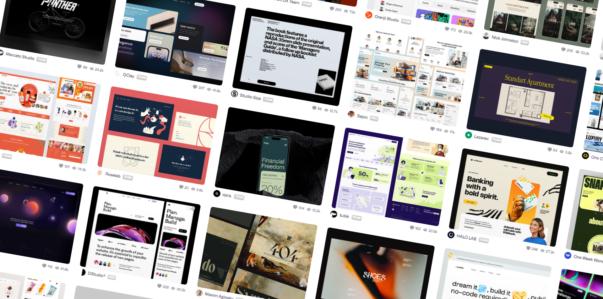
People have figured dribbble out. Endless scrolls of designs and concepts without proper function make it harder and harder to find work rooted in the real world. And don’t even get me started on the recent trend of grids, introduced by Apple and gobbled up by the community as the next best thing in design presentation.
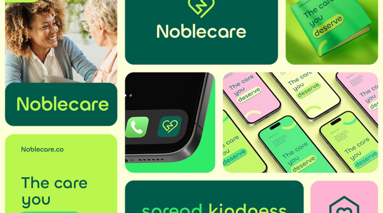
Pick a pretty color. Pick another one. Make a couple of eye-candy widgets and put it all in a grid that shows very little substance, but looks pretty. Harvest the likes. Repeat.
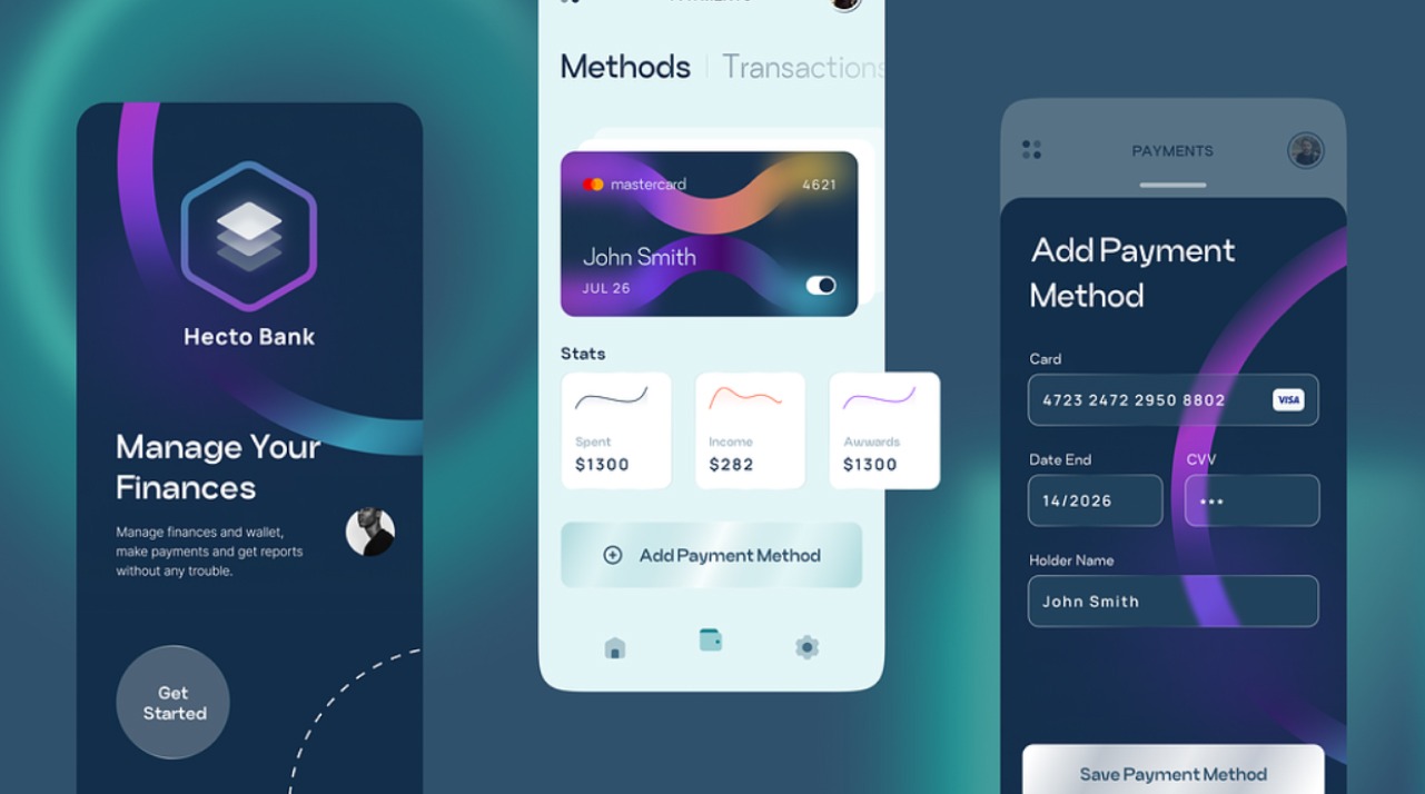
I’ve had the (mis)fortune to spend the last decade or so working on numerous fintech projects, some of which you can find on our Fintech page. Throughout those years I got to work on dozens of banking solutions for both web and mobile, grinding through rules and regulations, backend limitations and client preferences and let me tell you — I can spot a designer on dribbble who has never worked on a real banking solution in a second.
Pretty, colorful widgets that do nothing. Even prettier graphs and charts that are usually impossible to implement or fill with data. The simplest payment processes that would be shot down at the first meeting. Shiny looking payment cards that fit the design and not the real cards. Transaction descriptions that say “Spotify” or “Uber” or [insert the cool brand name], ignoring the fact that they usually take two or three lines in the real world.
The list goes on…
Have you ever actually seen or used a mobile banking app or web banking application that looks like those on dribbble? Of course you didn’t, and there’s a good reason for that. Actually, hundreds of reasons.
“But where is the problem, you miserable pixel pusher”, some of you will ask, waving a pitchfork.
Apart from designing solutions that have no grounds in reality, you mean? You see, internet is a beautiful thing in a sense that everyone has access to it. Even your potential clients. They, too, can see the pretty widgets and trendy grids. And having no grasp of what it takes to create a functional UI, they want what they see.
Honestly, I’ve had meetings where clients would pull out printed dribbble shots that had all the looks but zero functionality. Shots that asked more questions than they gave answers. Shots that ultimately never work in the real world.
It takes valuable time and effort to come to an inevitable conclusion that the bank’s backend systems just can’t accommodate your handsome widgets. When you put real data into the equation and combine it with client’s demands and the time it takes to fetch it from the core systems, all your pretty little widgets and graphs with all the chic looking details go down the drain faster than you can say “foreign currency payment”.
Of course, it’s not all that bad. You can still find real projects on dribbble and solutions grounded in reality, by people who know how to push solutions through the grinder of client demands and system limitations and come out looking both pretty and functional.
I only wish there were more of them. And I wish algorithms didn’t reward those who spam countless copies of the same thing that tick all the pretty boxes and none of those that ultimately matter.
In the end, the sad truth is that we’ve all seen this before. Distorted simplification of things, favoring form over function, looks over substance. Everything to fool the algorithm, to follow a trend, one more like, one more follow. “Awesome. Check out my profile.” It’s every social media platform all over again.
And we’ve all seen how great those turned out.