

In everyday life, we are surrounded by colors, yet we rarely pay special attention to them. We associate many objects with their typical colors - for example, ketchup packaging is almost always red, skincare products come in calming shades of blue and green, danger signs stand out in red, while eco-certified products are often associated with green.
Although we process colors subconsciously, their significance remains undeniable. In fact, they play a major role in influencing our emotions, behavior, and decision-making. The study of color psychology explores how different hues affect our feelings and everyday choices. Each color conveys a specific meaning, evokes certain emotions, shapes our mood, and serves as a powerful means of communication.
Color theory explains that color is essentially a sensory experience – it occurs when light of a particular wavelength stimulates receptors in the retina. While color perception is subjective and varies based on individual visual abilities, its influence on both personal and professional aspects of life is indisputable.
As a communication tool, color captures attention and conveys meaning, making it a vital element in branding and marketing. However, its significance differs across cultures – what a certain color represents in Europe may hold an entirely different meaning in Asia. For example, while white symbolizes purity and perfection in Western cultures, in many Asian traditions, it is associated with mourning and grief.
Universal Psychological Meanings of Colors
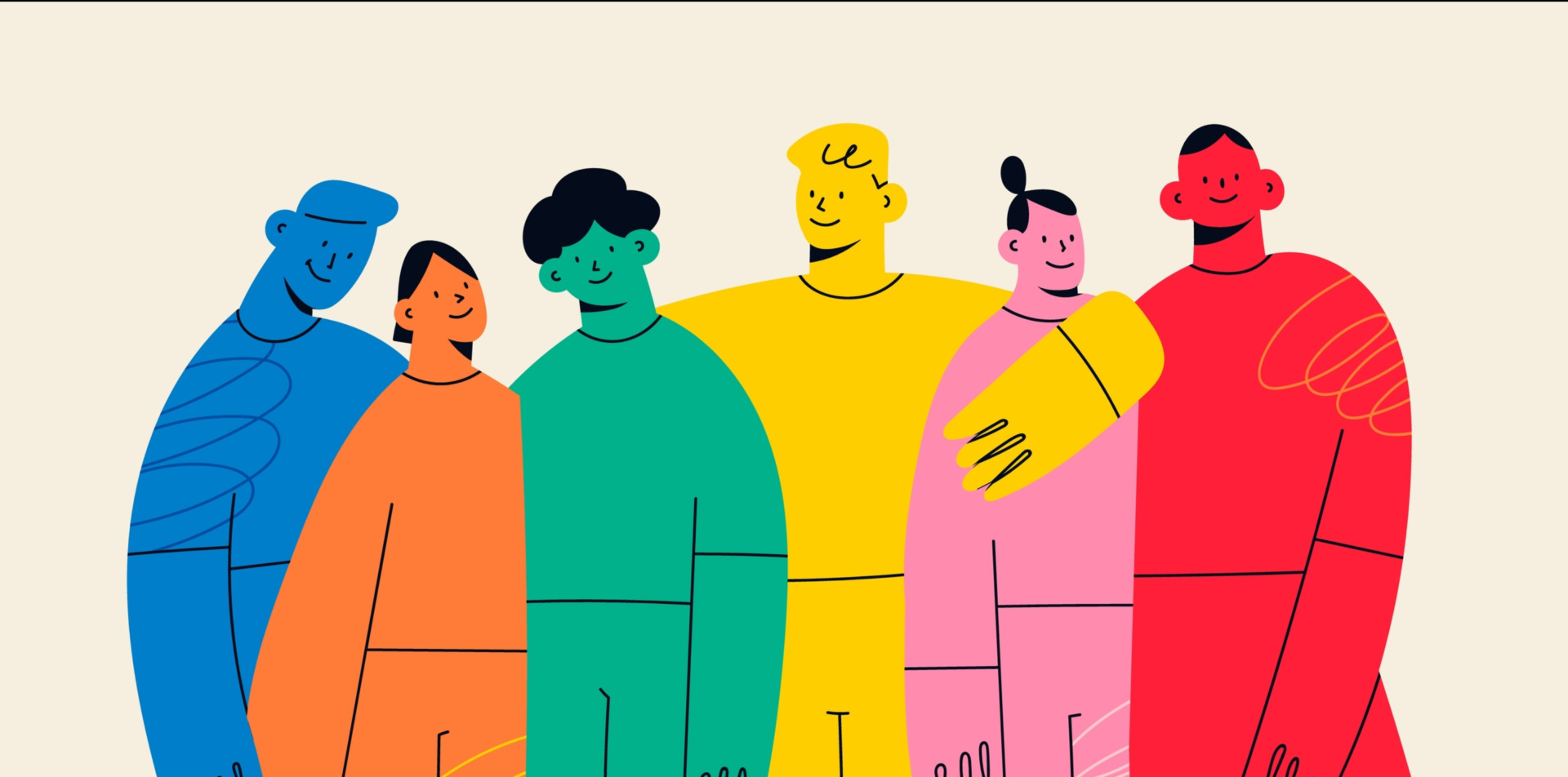
- Red evokes strong emotions, symbolizing energy, love, passion, as well as danger or aggression. It is frequently used in marketing as it grabs attention and stimulates action.
- Blue has a calming effect, promotes trust and professionalism, and is commonly used in corporate branding.
- Yellow represents happiness, optimism, and creativity, but excessive use can create a sense of unease.
- Green is linked to nature, balance, and relaxation, making it a popular choice in ecological and health-related industries.
- Orange exudes energy and cheerfulness, combining the intensity of red with the warmth of yellow, making it an effective choice for advertising.
- Purple is associated with luxury, creativity, and spirituality, often used to highlight exclusivity and artistic expression.
- Gray is neutral and elegant, frequently appearing in professional and minimalist designs.
- Black conveys power, authority, and sophistication, yet it can also evoke feelings of sadness or fear.
- White symbolizes purity and simplicity, though it may also appear sterile or cold.
- Gold and Silver are linked to luxury and prestige.
The Role of Color in Marketing
In the world of marketing, color is a crucial element. This is best illustrated by research showing that 84.7% of people consider color the primary reason for choosing a particular item or product. Within just 90 seconds—the time it takes for a subconscious judgment about an environment or product—between 60% and 90% of that assessment is based solely on color. Additionally, color enhances product recognition by up to 80%.
Some of the most recognizable examples include Coca-Cola, which is instantly associated with its signature red, and Milka, whose branding is strongly tied to its iconic purple. The impact of color on consumer behavior is best illustrated by Apple’s strategy—by introducing vibrant colors into iMac designs, the company successfully revived sales after two years of declining profits.
Color Contrast and Readability
Advertisements are more engaging when presented in color rather than black and white. One of the key factors that makes color so effective is contrast, or the way one color stands out against another.
Here’s a quick refresher on complementary color contrasts:
- Yellow and Purple
- Blue and Orange
- Red and Green
While contrast enhances readability, excessive use can lead to eye strain. A common example is websites designed with overly bold and highly contrasting colors, where the intensity of the elements makes reading difficult. To avoid this, it’s essential to maintain color harmony by selecting a dominant color, known as the accent color.
Color Psychology in Everyday Life
Beyond marketing, color psychology can be applied in daily activities, such as choosing clothing that reflects one’s mood or suits a specific occasion. Similarly, interior design relies on color to create desired atmospheres—whether for relaxation, focus, or energy. Understanding the psychology of color allows us to make more informed choices in both personal and professional settings.